
Color Psychology for Interior Design: How to Create Healing Spaces
Picture this: Your client walks into the room you’ve just designed, and within seconds, their body responds. Heart rates shift. Blood pressure changes. Stress hormones quiet or awaken. This is neuroaesthetics at work, and color is one of the most powerful tools in your design arsenal to create measurable health benefits.
Welcome to the intersection of color psychology and neuroaesthetics, where beauty isn’t just visually pleasing, it’s physiologically healing.
The Physical Power of Color
For years, designers have intuitively understood that color affects mood and emotion. What’s changed is that now, science can measure and document these effects with precision. When we experience certain colors, our bodies respond in measurable ways: our heart rates increase or decrease, our blood pressure rises or falls, and our bodies release the chemicals that make us feel happy, well, and satisfied, namely endorphins, serotonin, and dopamine.
There’s even something called galvanic skin response (GSR), an actual cellular structural change in our skin when we perceive beauty, including beautiful color combinations. This is the validation our industry has been waiting for. Science now confirms what you’ve always known: the spaces you create don’t just make people feel better emotionally, they measurably improve physical health.
This positions you as what science considers an alternative health resource. Dr. Claudia Miller at the University of Texas puts it powerfully: “Architects and designers have a greater ability to improve public health than medical professionals.” That’s the weight and importance of the work you do with color every single day.
“Architects and designers have a greater ability to improve public health than medical professionals.”
Color is in Our DNA
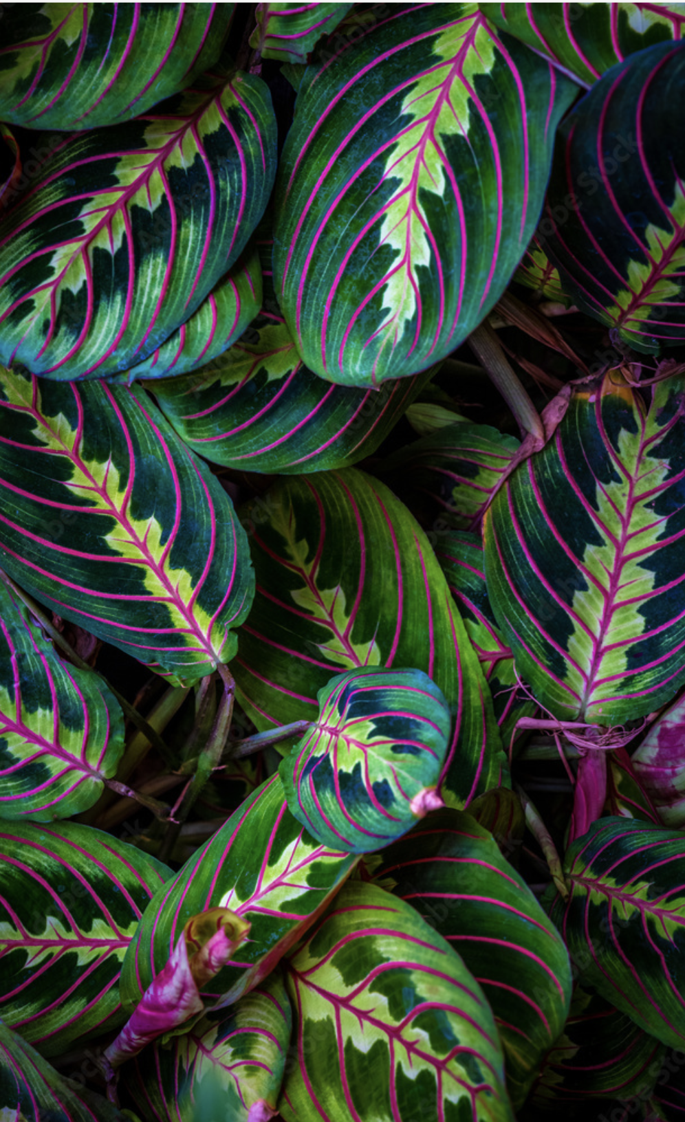
Our response to color is evolutionary. For millions of years, humans evolved in natural environments where color communicated vital information. Verdant greens signaled food and water. Clear blues meant safe skies and clean water sources. The warm golds of sunrise and sunset regulated our circadian rhythms. These associations are encoded in our DNA as part of what’s called our evolutionary inheritance.
This is where color psychology intersects with biophilic design. When we incorporate nature’s color palette into our interiors, we’re tapping into deep neurological patterns that help our clients’ ancient brains feel safe, nourished, and at ease. The colors we evolved with continue to trigger positive biological responses today, even when we’re spending 90% of our time indoors.
A Framework for Intentional Color Design
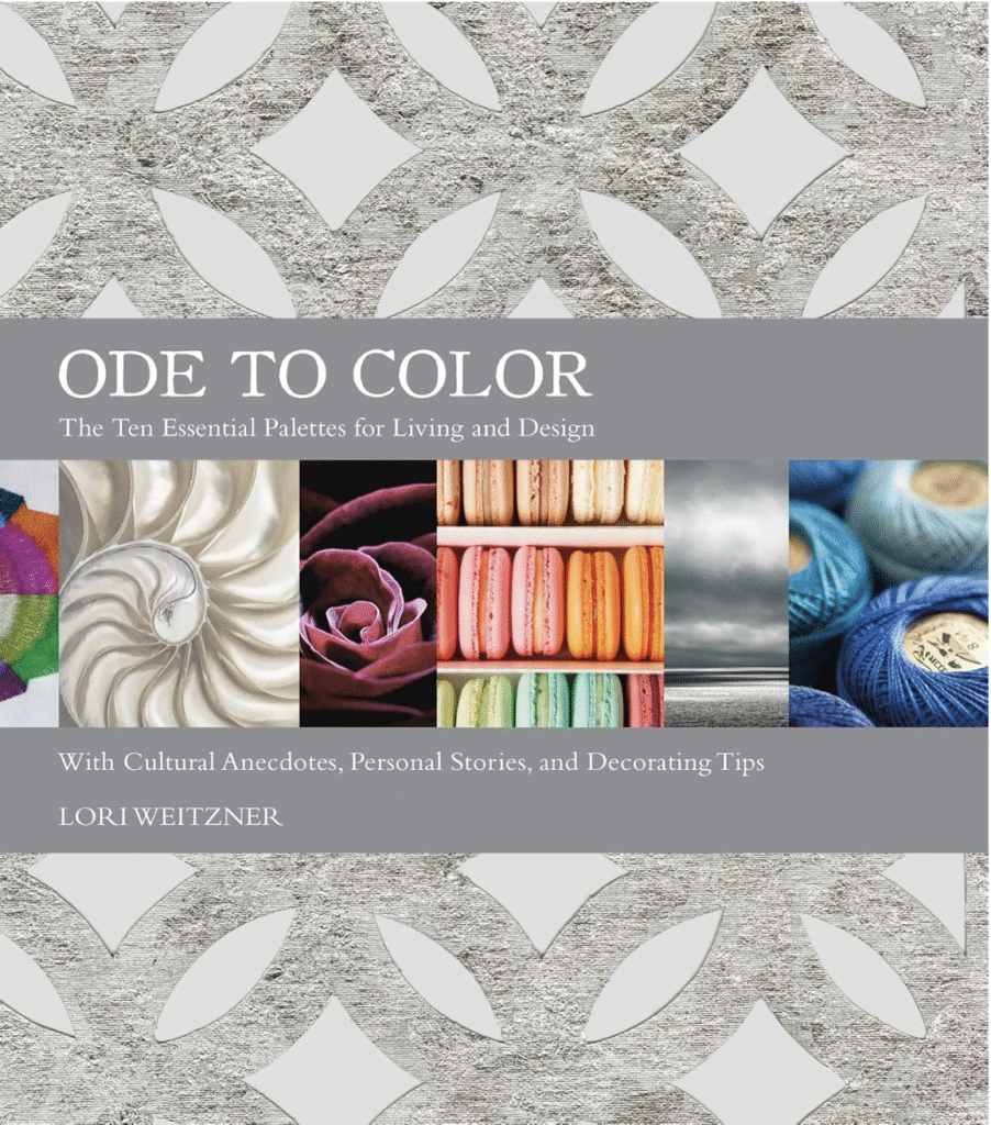
Lori Weitzner, a friend of Science in Design®, has developed a powerful framework called the Ten Color Worlds. An internationally recognized creative director whose textiles and wallcoverings grace museum collections from the Cooper Hewitt to the Victoria & Albert Museum, Lori has spent decades studying color’s impact on well-being. The goal of incorporating color psychology into your designs is helping your clients achieve moods and states of being that work well with their lives: colors that lower the heart rate and reduce stress in the bedroom, colors that energize and promote focus in a home office, colors that foster connection in the dining room, and so on.
Below is a glimpse into Lori’s Ten Color Worlds framework, where each color world creates distinct psychological and physiological effects.
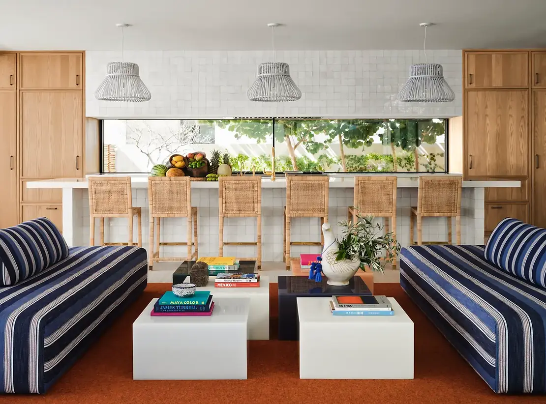
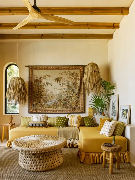
Waterside (Blues) encompasses the spectrum of blue tones from light to dramatic. These colors create feelings of stability and reliability, and are proven to lower stress and blood pressure. They’re intelligent, grounding colors perfect for home offices, bedrooms, or any space where clients need to feel secure and focused. Think of waterside as your go-to for creating environments that support deep work and restful sleep.
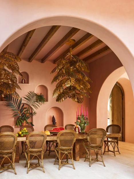
Garden Party (Pastels) brings the soft, fresh colors of spring—think delicate pinks, peaches, lavenders, and greens before colors reach full saturation. This color world is about joy, play, and renewal. Garden Party colors can lift spirits and create optimism, making them ideal for breakfast nooks, creative studios, or spaces where clients start their day. These colors are energizing in a gentle, sustainable way.
Fragrant Woods (Natural greens and browns) is the color world most directly connected to biophilia. These are the mosses, pines, umbers, and earth tones that root us in nature. Fragrant Woods creates feelings of connection and nurturing. In our increasingly disconnected digital world, these colors help clients feel grounded and present. They’re essential for creating restorative environments.
Night Shadows (Deep, rich tones) brings mystery and sophistication through deep grays, charcoals, espressos, and mahogany. This is the color world for intimate conversations, introspection, and depth. Night Shadows encourages us to go inward and contemplate next steps. Too much can feel heavy, though when used thoughtfully, it creates powerful spaces for reflection, whether that’s a library, meditation room, or an elegant dining space designed for meaningful conversation.
Each color world serves a specific purpose. The key is understanding your client’s needs: How do they move through their day? Where do they need energy versus calm? What’s their relationship with color based on their personal history and culture.
Download our Client Conversation Guide to learn more about how to talk to clients about neuroaesthetics in interior design, and why it matters for their home.
Applying Color Psychology with Intention
Effective neuroaesthetics asks us to remember the principle of homeostasis: balance between stimulation and rest. Science suggests the ideal ratio is about 80% rest with 20% fascination and curiosity. Have your color choices reflect this balance, and watch your clients find a new appreciation for their spaces.
Start by mapping your client’s daily journey through their space. When they wake up and their feet hit the floor, what colors greet them? As they move to their morning coffee, prepare for work, or settle in for the evening, how is color supporting each transition? Think of color as programming the environment to support their well-being throughout the day.
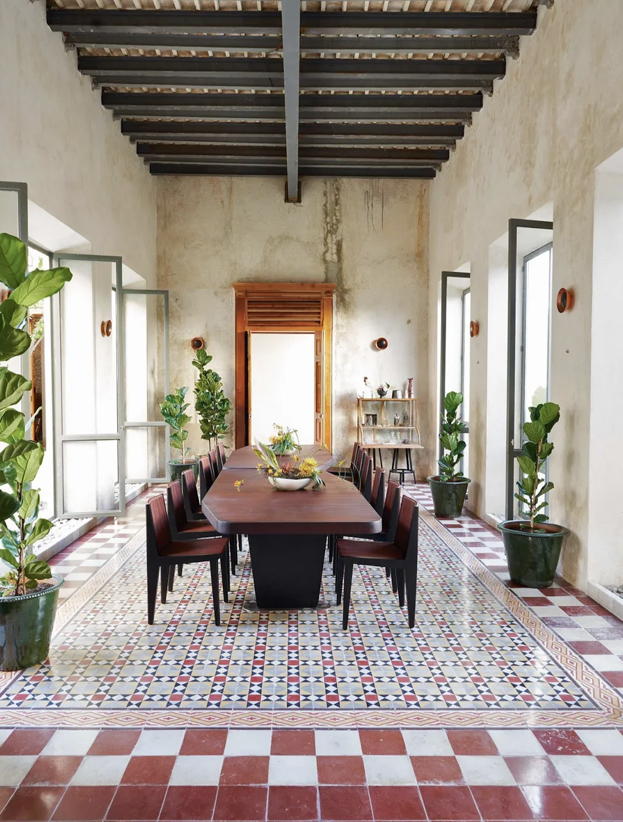
Image credit: Fernando Marroquin
Don’t forget to consider practical factors, such as how natural light interacts with your chosen colors throughout the day. Be attentive to the way colors transition from room to room, and whether or not the colors you’ve selected are reinforcing the function of each space.
When presenting color choices to clients, communicate the “why” behind your selections using neuroaesthetic language. Instead of “I think this blue would look nice,” try: “This particular blue tone will help lower your heart rate and create a sense of stability in your home office, supporting focus and productivity.” As an early adopter of neuroaesthetic design, you have expertise that can help your client foster their own well-being.
Download our Client Conversation Guide to see more ways you can discuss neuroaesthetics in interior design with your clients.
Color as Your Therapeutic Tool
The future of interior design is being born in science, and color is one of your most powerful tools for creating healing environments. Every color choice you make is an opportunity to improve your client’s health in measurable ways. As an alternative health resource, you can help lower their blood pressure, reduce stress, support better sleep, and energize their creativity.
If you want to deepen your expertise in color psychology and neuroaesthetics, we suggest enrolling in the Science in Design® Certification Program, where 200+ designers already apply these strategies. You’ll learn to master the science behind every design decision you make. Learn how to communicate the therapeutic power of your color choices to clients with confidence and scientific backing.
P.S. Color is just the beginning. Learn more about Lighting Design For Health & Wellness and Spatial Design & Neuroscience to get a better grasp on the depth at which science is supporting design as an alternative health resource.